Littlewoods Checkout Redesign

Digital Checkout Brief

Working in collaboration with Foolproof, create a new, innovative digital checkout experience for a major retail brand of your choice.
The Challenge
Redesigning the Littlewoods checkout experience, making it possible for the user to continue as a guest, before explaining the benefits of account creation.

Figma Prototype
Research Insights
Discovering the current problems with digital checkouts
Cart abandonment is one of the main problems within digital checkout experiences due to:
-
Having to create an account
-
The device used - predominately mobile
-
Extra costs the users weren't aware of

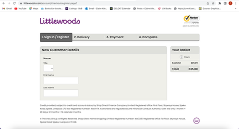
Littlewoods
Littlewoods' website checkout makes users create an account and enter a lot of personal information before they can purchase any products.
Based on my initial findings, I made the assumption that a user wouldn’t want to continue with their basket due to the amount of effort and detail they had to enter.
Testing my assumption with regular online shoppers, I got them to go through the process, to which they said that they wouldn’t sign up and they’d go to another site instead.


Competitor Research
Comparing the checkout process and features used in competitor flows
Researching competitors allowed me to explore different ways of completing a checkout, whilst comparing features to see which are more commonly used.


Getting regular online shoppers to go through two different checkout experiences, John Lewis and Staples enabled me to find out what they liked and disliked about the process, so I could understand the features that would best suit their needs.

Out of the two, John Lewis was the preferred checkout experience as:
-
Took less time
-
Required less information to complete
-
They could continue as a guest.

The pain points of the Staples checkout were:
-
They needed to create an account first
-
Have to fill in a long list of personal details.
User Personas
Understanding the user needs
Observing online shoppers allowed me to generate user personas, identifying they need a quick and efficient checkout process in order to complete their purchase on the site.


Value Proposition
Identifying pain creators and pain relievers
Value Proposition Canvas allowed me to consider the gains and pains of the redesign, helping me generate ideas on how these can be created and relieved to benefit the user in the best way, based on their needs.


Customer Journey Mapping
Understanding the customer's journey using the checkout
Understanding the journey of a user through a digital checkout enabled me to identify the goals of the customer but additionally for the business.
This allowed me to consider the message that needed to come across in the checkout, encouraging the user to buy, and then be persuaded to create an account.

Microcopy Card Sort
Carrying out card sorting exercise with the demographic to understand features on a checkout process
I wanted to see what information online shoppers thought they needed to enter to buy their shopping, to see what is required within a checkout process.
Writing the current checkout form fields on cards, I gave these to 4 online shoppers who sorted them into need and don’t need.
Considering Hick's Law helped identify what features the users would benefit from, without creating information overload for the user.


User Flows
Simplifying the current user flow


To redesign the checkout experience, I needed to be able to simplify the current process. Creating a user flow on Miro, I was able to identify the number of steps the user currently has to go through before carrying out a card sorting exercise, using features determined by my microcopy study, to create a new information architecture.
New Information Architecture
I was able to create a simplified information architecture, splitting the flow into two different pathways for delivery and collection. This was something that wasn’t clear within the current digital checkout experience.

Low - Mid Fidelity Wireframes
Initial wireframes, implementing features discovered through research


From my findings, I began to create low fidelity wireframes using Figma, including placeholder titles on the form fields to reduce the amount of space taken up on the screen allowing all the information to be seen by the user.
Additionally, adding floating titles once the field is active allows the user to remember what information they are entering.
Implementing the colours of Littlewoods, made clickable targets more visible to users, suggesting to the user where to tap to continue with their checkout process.


Usability Testing
Carrying out multiple rounds of user testing
Low Fidelity Testing

Low fidelity testing validated that the flow was easily understandable and the user knew what to do at each stage of the process, highlighting issues with microcopy and formatting issues where form fields were too close together.
High Fidelity Testing


High fidelity testing helped me consider making small design considerations when users try to continue in the process without having entered all of their details, creating error messages.
Additionally, users wanted to have the option of checking their basket, a feature not yet designed, once they reviewed their checkout before they pay.

Developments
Improving the prototype from results discovered in usability testing
Error Messages


Adding additional microcopy and highlighting the form field indicates to the user where the missing information is.
Editing the Basket

Separating the wishlist and remove button reduces the risk of clicking the wrong button whilst implementing an undo feature if the user decides to change their mind.


Shortcuts


To make it a quicker process for the user, having the option to use pre-save details stored in users phones would decrease the time it takes them to enter their details, including their personal and card details.
Final Outcomes


Conclusion
From this process, I created a successful guest checkout experience for Littlewoods, reducing the amount of information the user had to enter to buy their products whilst explaining the benefits of creating an account to get them to sign up, which received positive feedback from the collaborative brief partner, Foolproof.
Carrying out more user testing at the beginning of my process and getting them to use competitor checkout flows enabled me to discover the user needs, which were backed up by primary research statistics. This highlighted potential features to include and avoid, which is a process I would like to use more, saving me time to allowing me to move on to the design process.
If I had more time on this project, I would have liked to have researched and experimented with the idea of a ‘one-click checkout’, developing from my idea once the user has created their account, further making it simpler and quicker for the user. Additionally, I would like to experiment with new software, enabling me to develop my coding skills in order for the checkout process to be completed accurately.