Proviris Solutions

The Client
Proviris Solutions is a health & wellbeing company that uses genetic, biochemistry and nutrition science and testing devices to improve the health outlook of people.
The Brief
A visual and engaging tool for users to complete a diet assessment online and to keep track of their dietary intake.
The Challenge
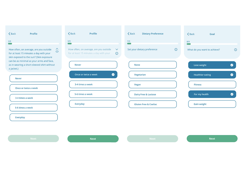
Working in a team of 6, create an app for the health and well-being questionnaire that customers complete fortnightly, whilst making it easier for them to remember what they have eaten to complete the form.

Research Insights
Understanding our client, their users and the current problems
By interviewing the client and their customers, we were able to find out more about the company, discover the current problems with the dietary questionnaire, as well as with finding out the needs and requirements for the new application.


The Problems
-
The current questionnaire takes too long and is repetitive
-
Users don't understand why the questionnaire is necessary
-
Users can't always complete the questionnaire at one time
The Solutions
-
Shorten the questionnaire - work with the client to remove unnecessary questions
-
Teach the users why each question is being asked to understand its importance.
-
Create a questionnaire that can be completed in different stages.
Competitor Research
Looking at direct and indirect competitors to see similar applications
Looking at apps that allow users to track their health, enabled us to develop our ideas on how to create a dietary intake tracker, making it easier for users to answer the fortnightly health questionnaire.


Diary Study
Getting a demographic user to use a diet and exercise tracker for a week to see what they liked and disliked about the process.


From this, I was able to report back to the group the benefits and pain points the user found when using an exercise tracker for a week.
This gave us an understanding of what the user would want to see and use within the application.
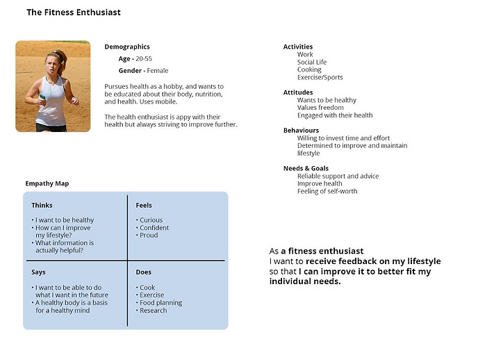
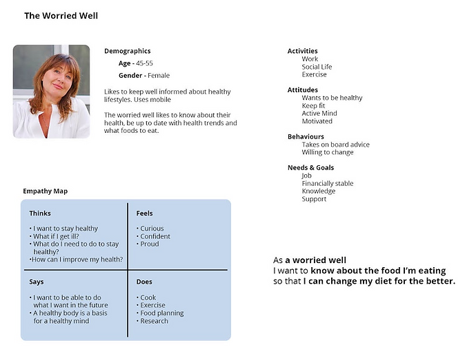
User Personas
Types of users at Proviris Solutions based on our research
From speaking with the client and the users, myself and 2 other team members were able to generate 3 different types of user personas, based on our research gathered, with varying goals and motivations for each.
Identifying these personas enabled design choices to be made to suit all of the users, taking their behaviours into account.


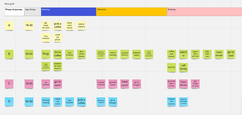
Customer Journey Mapping
Interviewing the demographic to understand what they do in the day, to know when they have time to complete the questionnaire
Customer Journey mapping highlighted that some users cannot complete the whole questionnaire in one sitting. This created an idea for a questionnaire that can be completed in stages and over a period of time before they have to complete it again.
User Flows
Understanding how the user will navigate through the different features in the app
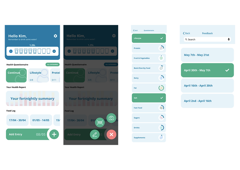
As a team, we carried out a card sorting exercise to see how the user would use the app and the features it would include. This built up the information architecture, identifying where the user would find the questionnaire, the food diary and their results.


Initial Wireframes
Initial ideas of the app using the user research and findings


Working together, a structure of the app formed, which was tested to by users to validate the navigation.
This allowed tasks to be divided up so each team member could focus on an aspect of the app to be developed, to be tested.
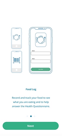
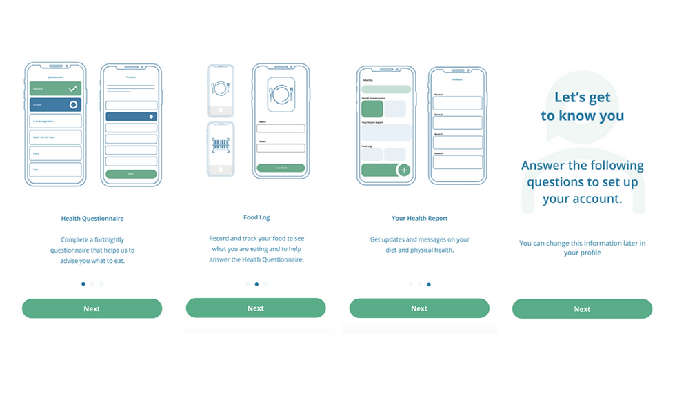
Onboarding & Developments
Focussing on educating the user about the app, explaining what each feature does in order to complete the health questionnaire
This is the part of the prototype I designed, educating the user about the app and getting them to complete the first stage of the questionnaire.
Experimenting with imagery and shapes helped tell the story of the app explaining the different features of the app, and supporting the short descriptive text underneath.


Exploring entry fields and input methods
Whilst developing the initial part of the questionnaire, I experimented with a number of input methods to discover which were easier for the user by getting them to test the designs.
I noticed that the users preferred the designs that had the least amount of taps involved, which made it easier for them to complete the questions.


Colour Theory


Colour was important to our client and from our research, we wanted to keep the core colour blue which was used already in the logo.
Additional colours of green and lighter blues were used to portray the medical/health care side of the app. However, the colours used were softer to make the app seem less daunting and approachable as people worry about their health care and medical practices.
User Testing
Testing the prototype with the client and customers of Proviris Solutions to see where to develop and what is working well

Comments from the Testing
-
Able to step through the onboarding process with ease with a few minor prototyping problems.
-
Understood they could pick and choose what part of the questionnaire to complete.
-
Users were confused by the food diary entry at first but thought it would be a good idea to keep track of their intake.
Iteration Developments
-
Change microcopy on the home page to make it clearer what each feature is.
-
Simplify the food diary entry form to make it less confusing.
-
Develop the settings to change user goals throughout the process of completing the questionnaire.
Final Outcomes
Developments from user testing and client comments


Conclusion
Overall as a group, we were able to work as a team to meet the brief by creating a tool where users can complete their fortnightly questionnaire, and implementing an additional tool of being able to track their diet to help them answer the questions.
What worked well was how we conducted the brief as a team, splitting up the tasks so that each part of the app was completed. My communication skills were developed by working with others as well as understanding how to communicate with the client at each stage of the process.
If I were to do this project again, I think more user testing would have been beneficial, especially in the earlier stages of testing our prototype. Due to the limitations of Covid, we were unable to test the app in person on the device we designed it for, but rather on a desktop browser which could affect our results.
With this in mind, our client was pleased with the outcome of the app and the changes we had made to the questionnaire, which they thought would benefit their customers in a positive way.